Sarora Knots
Grow in style
Sarora Knots is an independent homeware brand that hand-weaves statement eco planters and hangers for the creatively minded. Founded in 2016, their unique approach brings the rich heritage of weaving and knots into the 21st century. During 2020, this creative startup saw a sharp increase in demand, however it also brought an increase in competitors as more and more hobbyists took up the practice from home during the pandemic. Sarora Knots needed a clear identity that cut through the noise while honouring the rich heritage of the craft.
Client
Sarora Knots
Project type
Branding & Identity: Rebrand
Date
Our Role
October 2022
Design & Illustration
Credits
Benjamin Franklin
Photography
Visit Site
The challenge
A lot of our micro-small business clients approach us with an amazing understanding of their product, but less of an understanding of its worth. And this is where a new brand identity and strategic thinking can really help elevate how someone perceives a product. Especially when it’s handcrafted.
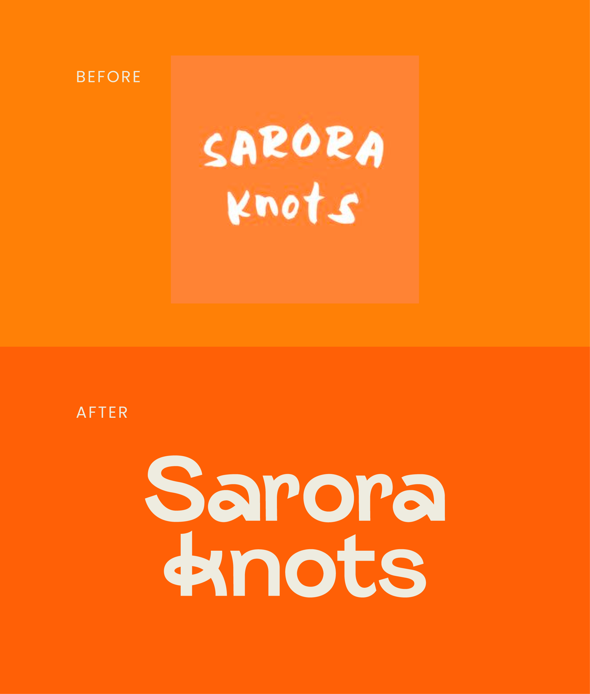
With the increasing costs of running a business, the pricepoint of Sarora Knots also needed to increase, and their existing logo no longer reflected their new premium offering. It also didn’t hero the high quality of the products. We needed to create a crafted-style logomark that felt much more refined.
The result
After some research into weaving and knotting, we came up with a bunch of ways to create letterforms out of knots. This was then applied to an existing typeface with an organic feel, to create a fully bespoke logomark.
The illustration style is influenced by lino cutting techniques, to continue the crafted aesthetic, while keeping the edges clean, crisp and fresh. We also worked with Sara to fine-tune her brand values and USPs, which were accompanied by new icons in the new Sarora Knots illustration style.


