The Cheese Bar
Real British cheese
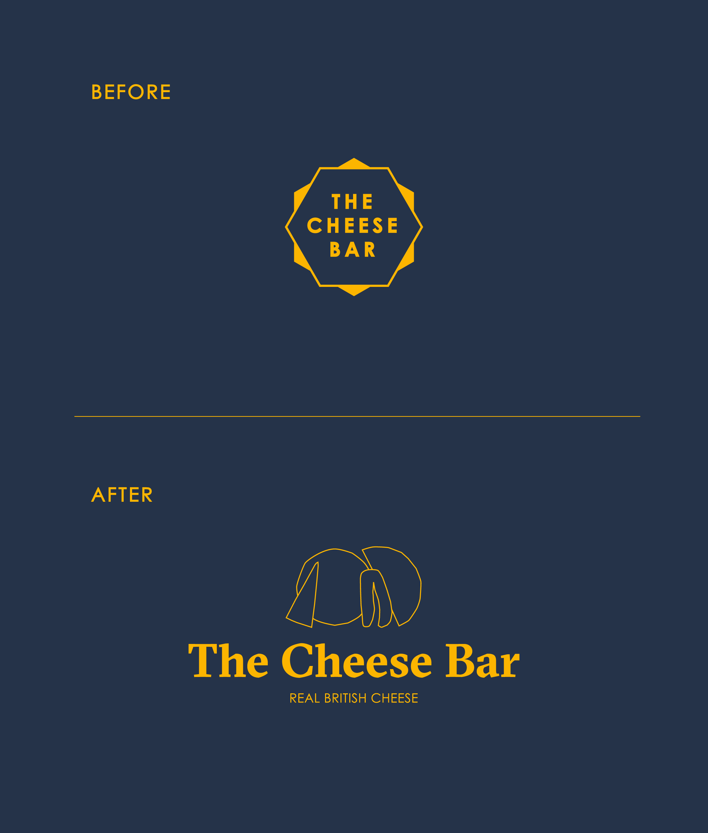
The Cheese Bar is a chain of restaurants across London dedicated to championing British cheese. When they first approached us, the client had recently opened their flagship destination in the heart of Camden Market, but something was missing. They felt their existing brand lacked soul and – more importantly – cheese. Along with architect practice SODA Studio, we took the brand back to where it all started: crafted, loved and locally sourced ingredients.
Client
The Cheese Bar
Project type
Branding & Identity: Rebrand
Date
Our Role
Summer 2018
Design & Illustration
Credits
SODA Studio
Creative Direction
Visit Site
Modern heritage
The new identity needed to feel current and relevant, while honouring the collective heritage of the well-established selection of cheeses that the restaurant offers. The previous identity also failed to match up to the brand’s premium offering.
So, we chose a typeface that reflected the act of carving cheese, and a Matisse-esque crafted style of illustration to refer to this carving action too. After closely studying the forms and colours of The Cheese Bar’s cheese collection, we created a typology of branded cheese icons. From this we created a myriad of combinations, finally settling on the balanced group of four cheeses you now see in the brand’s icon.
Food & colour go hand-in-hand
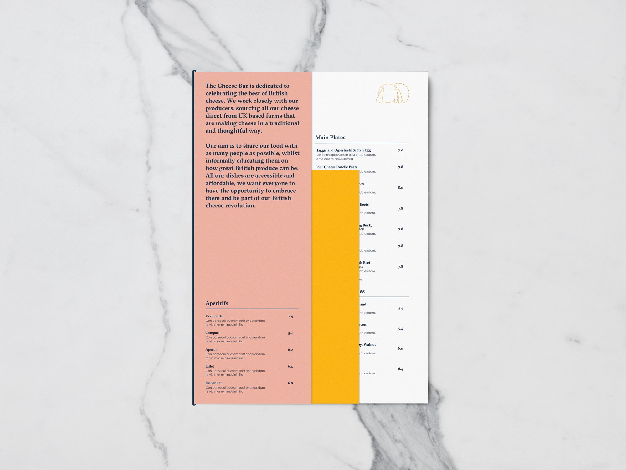
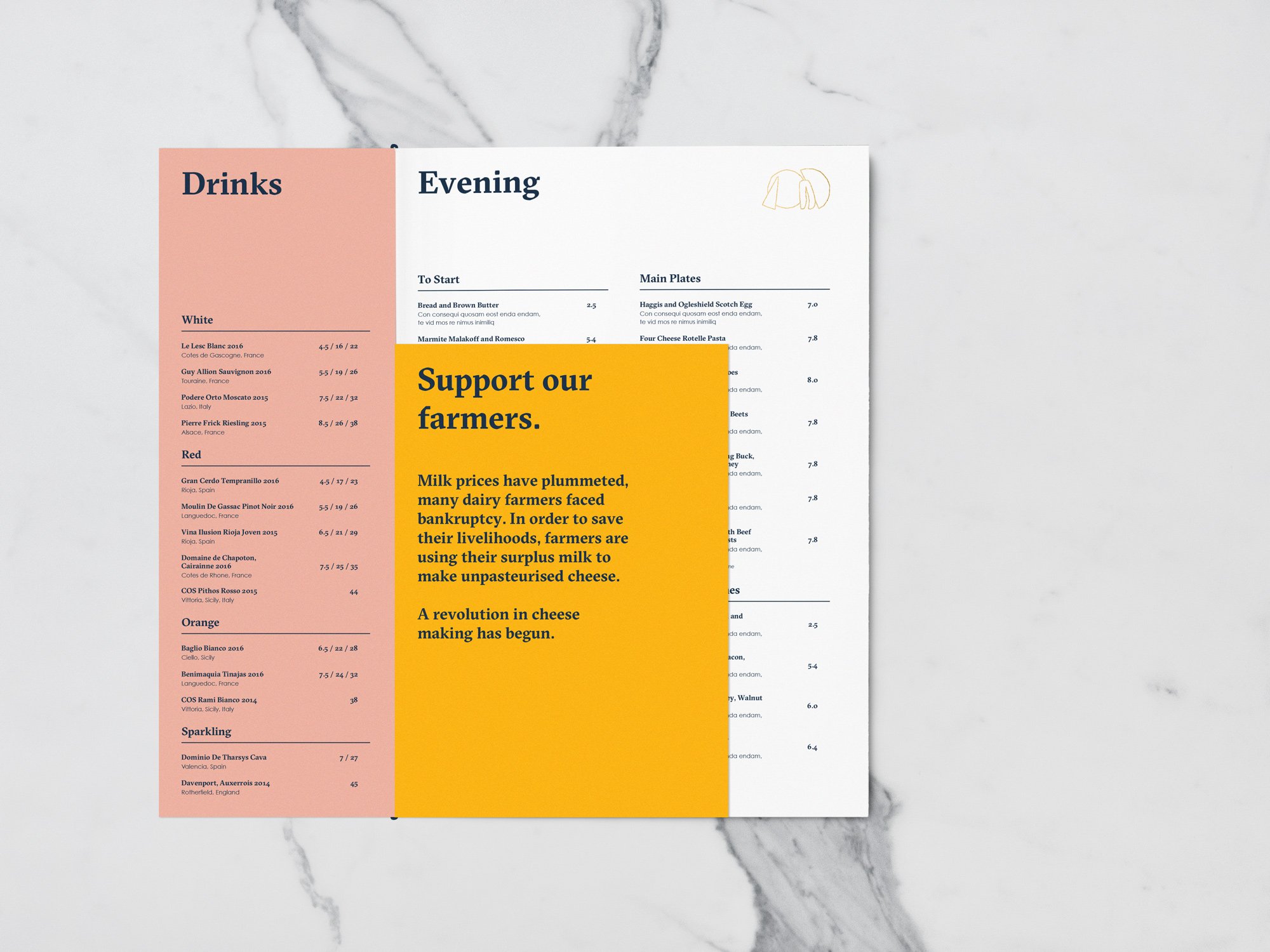
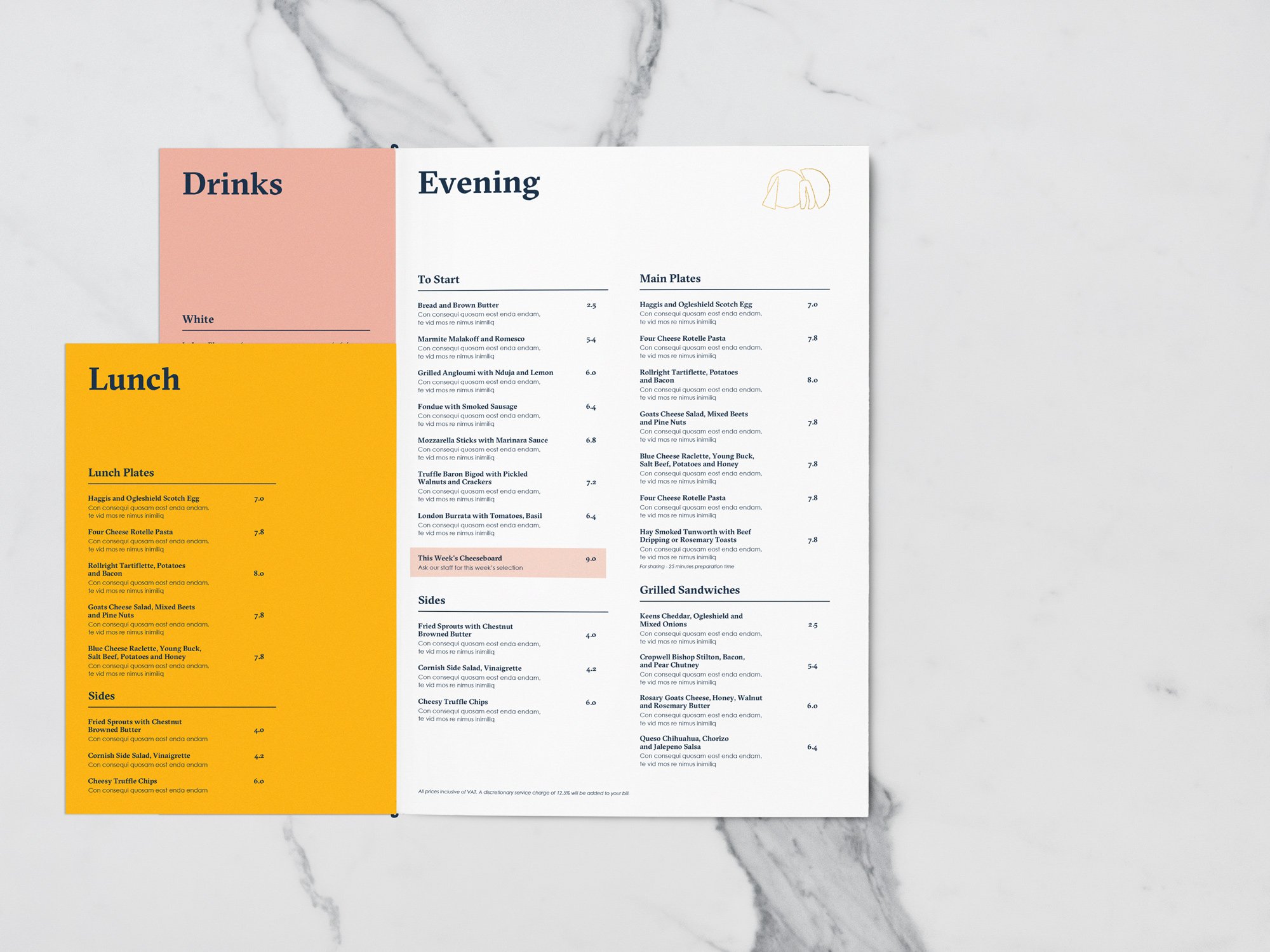
Colour is always important, but vital when creating identities for consumable brands. We darkened the existing blue and yellow colour palette, not only to make the brand match the premium offering but also to make the brand look and feel more tasty. A soft pink and oatmeal were then added as secondary colours to help build out the brand world.
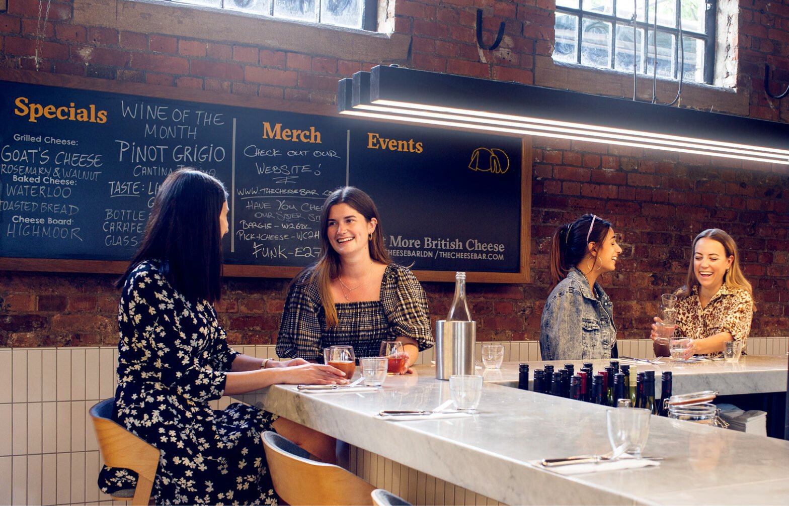
The restaurant has since grown into a well-loved chain, and the identity we created has built the foundations for a range of sub-brands to emerge, as well as books and merchandise.


