Eat Real
The Realest.
After the merging of PROPER and Eat Real under WARP Snacks, the team thought it was time to bring the branding of the cornershop favourite in line with PROPER’s high standard of design output. Under the new brand direction of ‘The Realest’, Eat Real’s new brand world heroes the everyday – referencing the aesthetics of their home in your local newsagents – everything from receipts to crates to price tags.

Client
Warp Snacks:
Eat Real
Project type
Packaging & Branding
Design & Art Direction
January 2024
Credits
Date
Our Role
Tash Randolph
Graphic Designer
Visit Site
Liam Hart
Photography
Visit Site


“I’ve worked with Ewa for over a year, and it is always an absolute pleasure! Ewa is a reliable, fast-paced worker who often turns around projects with tight deadlines without any issues. Because of her varied skill set, Ewa is able to switch between projects that require big blue-sky thinking and ones that require a more commercial lens with ease. She has a really good understanding of our brands, meaning I always have complete trust in her to nail a new brief or project.”
Kiera Maclean, Studio Manager at WARP Snacks


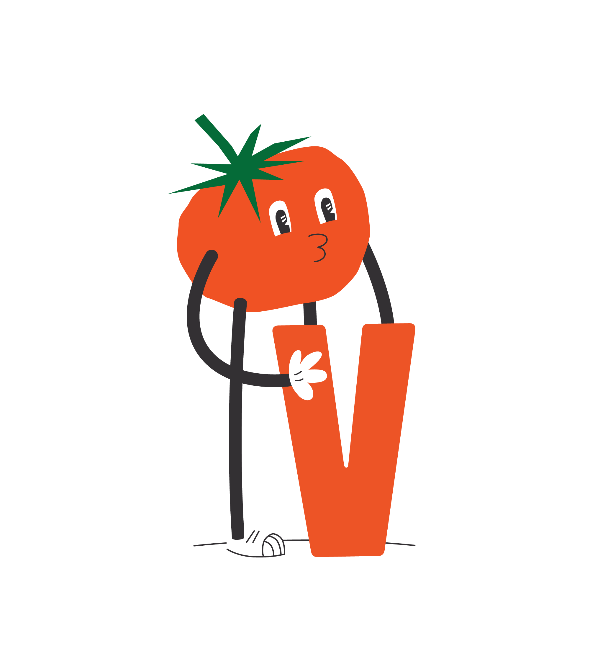
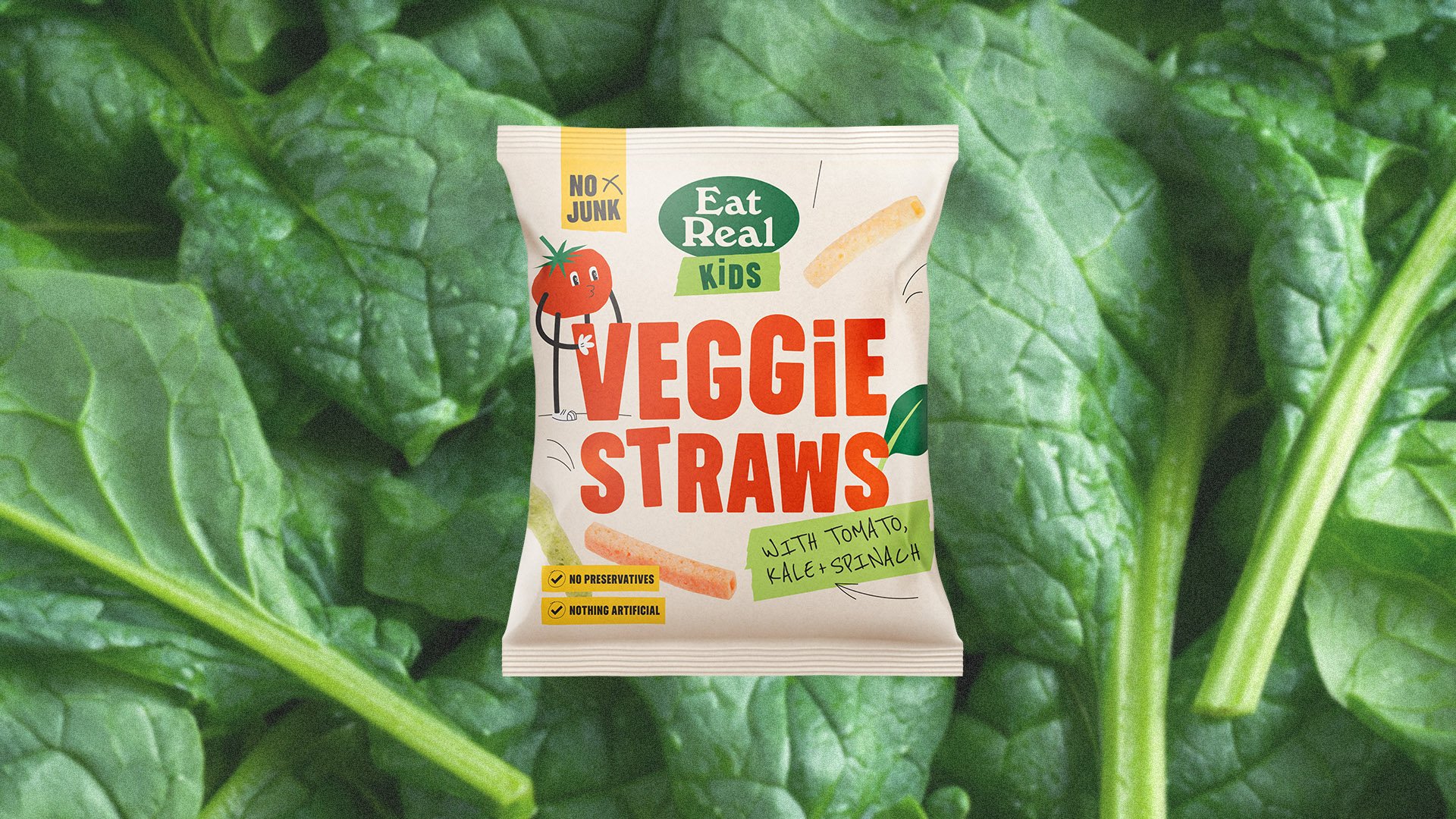
Don’t forget the kids
Once the direction was set for Eat Real’s core range, we worked on expanding this look and feel into their kid’s snacks. A tomato mascot was created to grab the attention of children, whilst adopting the clean typography and reduced natural colour palette from the core range, to please their health-conscious parents.