Dewgood Skincare
Great skincare for good people
The receptors in our skin are how we experience the world around us, which is only magnified when we touch our faces during our skincare routines. But oh-so often, skincare brands opt for sterile typefaces and bland colours to compensate for the long lists of ingredients in their products. Dewgood’s founder, Olivia, wanted a brand identity that broke this mould, and brought a sense of play back to skincare routines.


Client
Dewgood Skincare
Project type
Packaging, Branding & Creative Direction
Creative Direction & Design
May 2023
Credits
Veega Studio
Photography
Visit Site
Lucy Harper
Brand Strategy
Visit Site
Date
Our Role


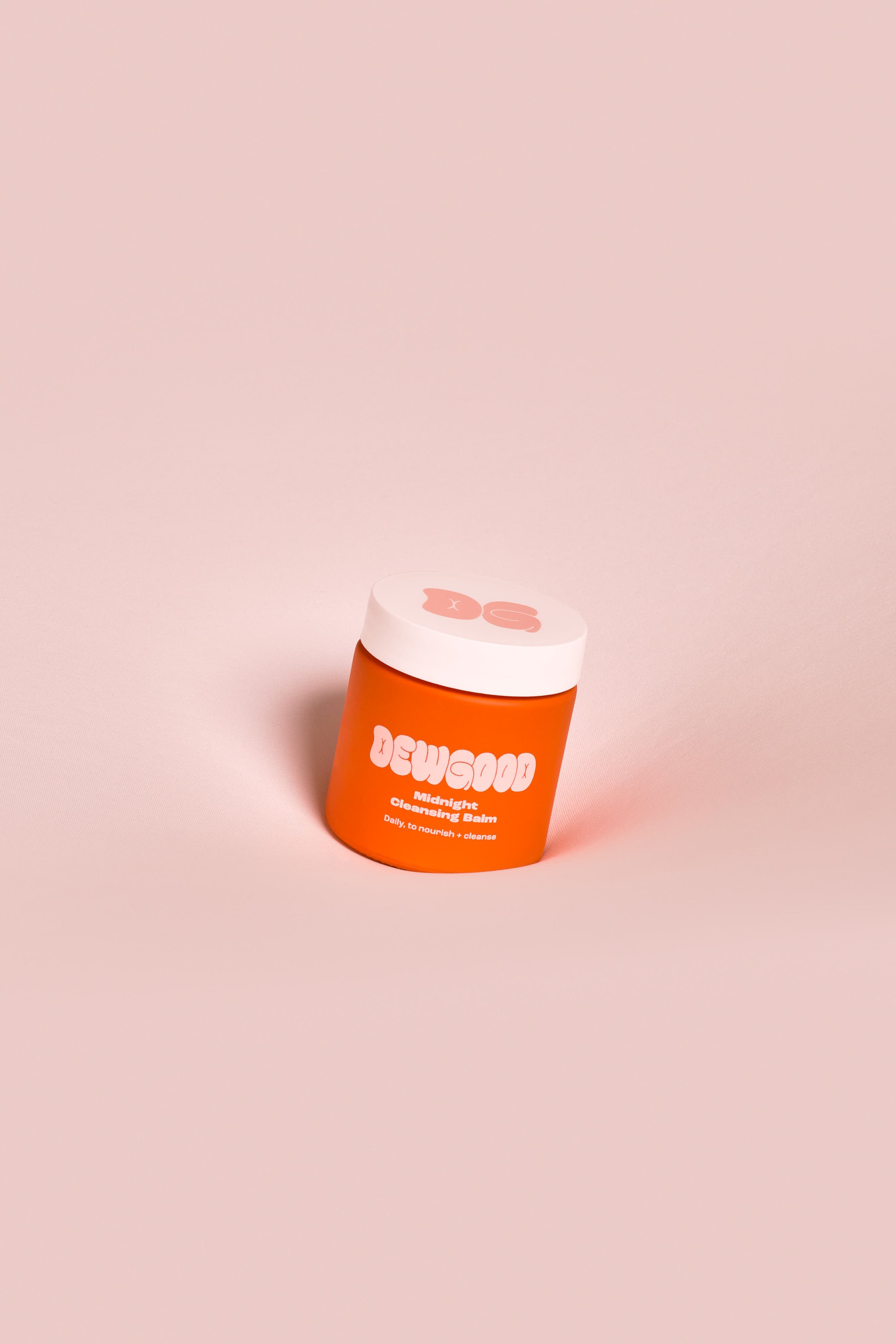
Glow slow
Together, we set out to build a visually tactile and playful world for the Dewgood brand, led by a brand identity that celebrates the joy of having soft, pillowy, dewy-looking skin. Our concept heroes self-care with fun and playful graphic treatments, while creating a sense of tactility and interaction. The bubbly logomark encourages the consumer to make a connection between the brand and the application of the product, helping them to think more about what they’re feeling and stay present during their skincare routine.


Creating pockets of joy
But a brand identity doesn’t stop at its logomark. We wanted the feeling of pillowy soft skin to permeate into the environment that surrounds Dewgood products across all branded assets. So we briefed collaborator Veega Studio to construct a landscape that envelopes and cushions Dewgood products in the brand photography, while setting the tone for highly sensory interactive branded experiences in the future.